
One of the things I’ve enjoyed most since getting into fountain pens is searching for those perfect pen and ink combinations. There’s nothing more satisfying than inking up a pen with a different ink, starting to write and finding that it just feels right!
Unfortunately, I’ve also had the opposite happen, where I’ve inked up a pen with an ink that I thought would be perfect, and upon writing, I’ve immediately gone ‘nope!’ I may love the pen, I may love the ink, but together? Nope!
I often have no discernable reason behind why I don’t end up loving some combinations as much as I’d thought I would, and it’s got me thinking about how I go about matching pens and inks in the first place. And I’ve very curious as to how other people do it!
I know a lot of people like their ink to perfectly match the colour of their pen, whilst other people don’t care about that at all, and will pair any ink they like with any pen they like. Other people might prefer to consider the properties of the pen, versus the properties of the ink, to figure out what will give them the best writing experience, regardless of colour matching.
For me, I think I tend to match pens and inks based on ‘vibes’ which is a very annoying and vague way to describe it. I’m not 100% set on matching the colour of the pen to the ink, but I also don’t like clashing.
Often I’ll keep the ink colour in the same ballpark as the colour of the pen, but will deviate a little. For example, my TWSBI Eco in Persian Green (a lovely teal colour) is currently inked up with Diamine Meadow, which is a bright, purer green. And I’ve been really enjoying this combination!
Other times I’ll choose a colour that is different from the pen, but has a similar ‘feel’. For example, my Jinaho x159 in coffee brown is currently inked with Diamine Evergreen, which is a dark, olive green. They don’t technically ‘match’, but to me they feel right together, as more neutral, classic colours.
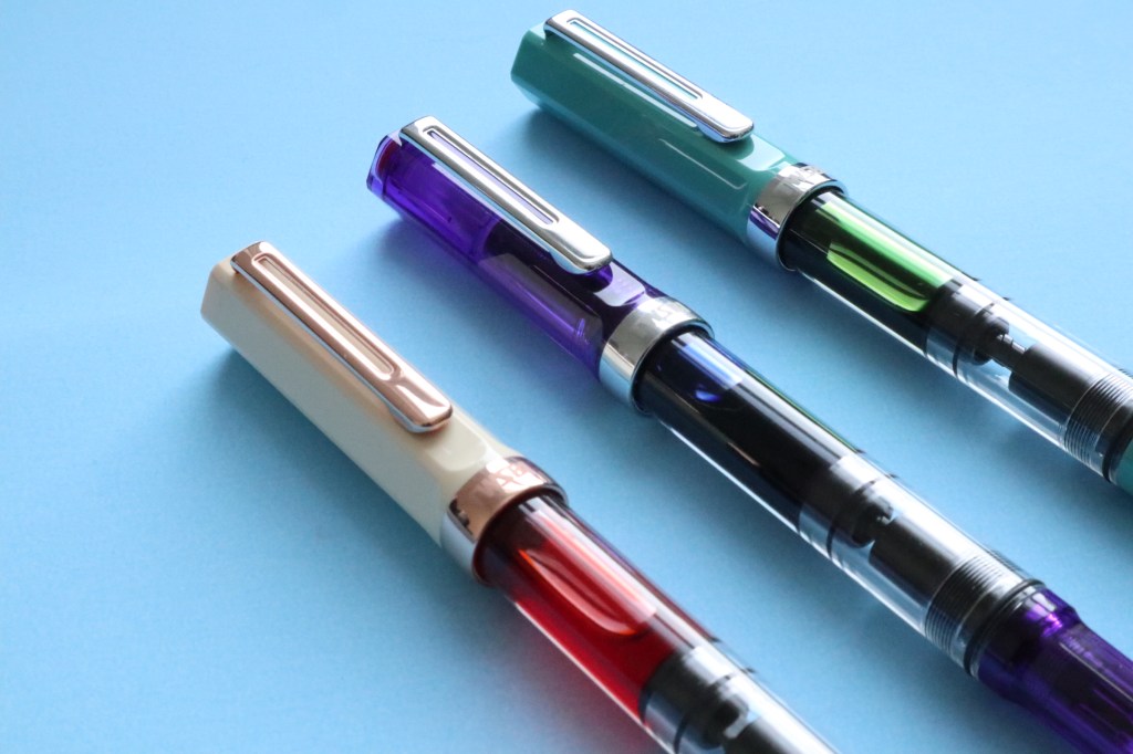
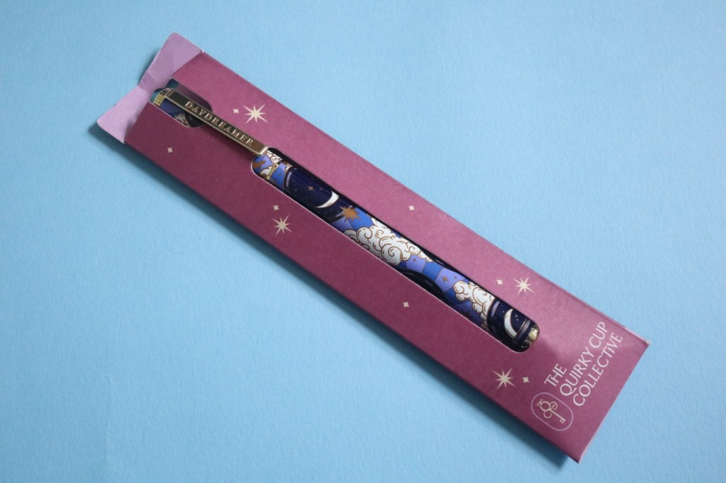
That then brings up the problem of more neutral coloured pens, and what to match them with. For someone who generally prefers brighter coloured stationery, I seem to have collected quite a few neutral coloured fountain pens, including a Lamy Safari in Cream, and the TWSBI Eco Creme with Rose Gold. I love the look of these pens, but they have less obvious ink colour matches.
When I first got the Cream Lamy Safari I thought that because it was a neutral colour, it would go well with any ink. Because I felt there was something quite classy and feminine about the colour of the pen, I first inked it up with Diamine Pink, which is a bright, in-your-face pink. I quickly found that I didn’t like it that much, and reached for the pen less, until I finally gave up and cleaned it out. I still haven’t found the perfect ink for that pen, however much I like it. But I have now paired Diamine Pink with a pink sparkly Jinhao 82, and I love it! It was just something about the pen and ink combination of the Lamy Safari and the pink that didn’t work for me.
With other neutral pens, I’ve since taken different approaches, and had more success. For example, with my Jinhao 82 in Winter Snow I chose a more subtle colour, and paired it with Diamine Sepia, and I love it! I think that the golden brown colour of the ink matches well with the gold trim of the pen, which then influenced my choice of ink for my TWSBI Eco Creme.
I struggled a lot with matching an ink to the TWSBI Eco Creme, because it’s such a pretty pen, and I wanted to do it justice. Plus, the fact that with the TWSBI you can see all the ink sloshing around inside made it feel even more important to choose wisely. I decided to risk another neutral pen/bright ink combination, but this time I tried to compliment the warm tones of the cream pen and rose gold accents with a warm-toned ink. I chose Diamine Peach Haze, which is quite a bright orange, and I’ve been loving both the look of the pen and the writing experience with this combination. In this case, whilst I couldn’t match the colour of the ink to the pen (who would want a cream coloured ink?), I could match the temperature of the colour, and it seems to have passed my pen and ink vibe test, anyway!
As for black pens, I tend to pair them with darker coloured inks, such as green/blacks, midnight blues and dark, burgundy reds. And of course, sometimes I just pair them with plain black ink!
So overall my pen and ink matching isn’t a strict colour matching exercise (although that’s often what I do!), but I’m still quite picky, and like them to compliment each other in some way. Whilst, for me, matching fountain pens and inks isn’t an exact science, and I sometimes get it wrong, I definitely know when I’ve struck gold, and found the perfect combination!
So I’d love to know how you match your fountain pens and inks! Do you try to match the pen and ink colours exactly, or do you not care? Or do you prefer to consider the properties of the pens and inks and match them that way?
![Do I really need every colour of [insert pen brand here]?](https://inkyimaginings.com/wp-content/uploads/2026/04/9832c460-705f-474f-baa3-2abf29b4fe12.jpg?w=1024)

Leave a reply to Rachel Cancel reply