
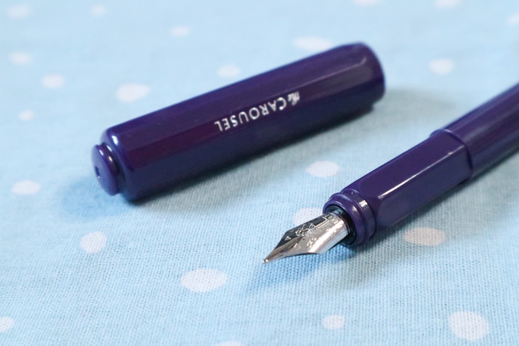
Recently I’ve been trying to get some fountain pens back into rotation that I haven’t used in a while. One of the pens I rediscovered was the Ferris Wheel Press Carousel fountain pen in the Poison Envy colour that I bought very early on in my fountain pen journey. Until now I’d only had it inked once, and then I put it away, because to be honest, I didn’t love it.
However, I decided to give it another go this month, and since I never reviewed it back then, I decided now would be a good time. So here we are!
The Carousel fountain pen is Ferris Wheel Press’ budget offering at just £16 here in the UK, so it feels bad to be too harsh on it, but even when compared to similarly priced pens, I don’t think it holds up too well. But there are some good things about it, so I guess we should start there.
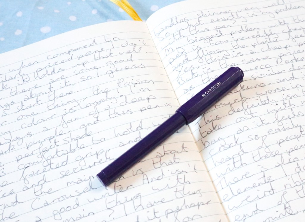
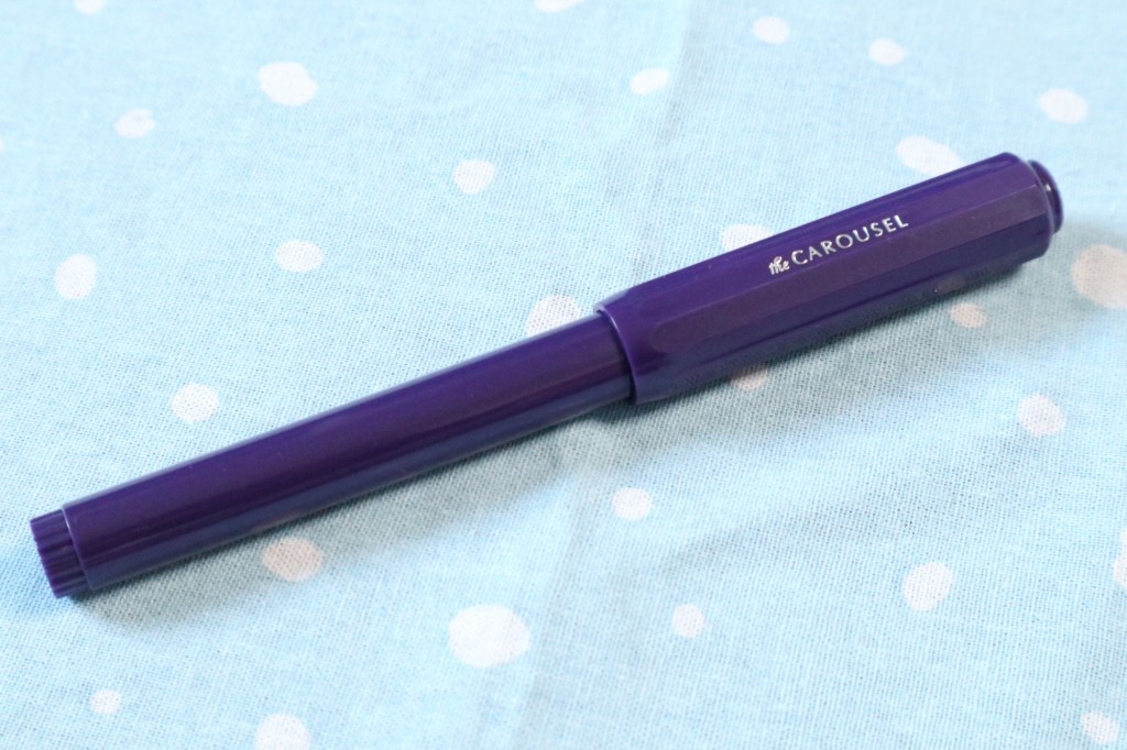
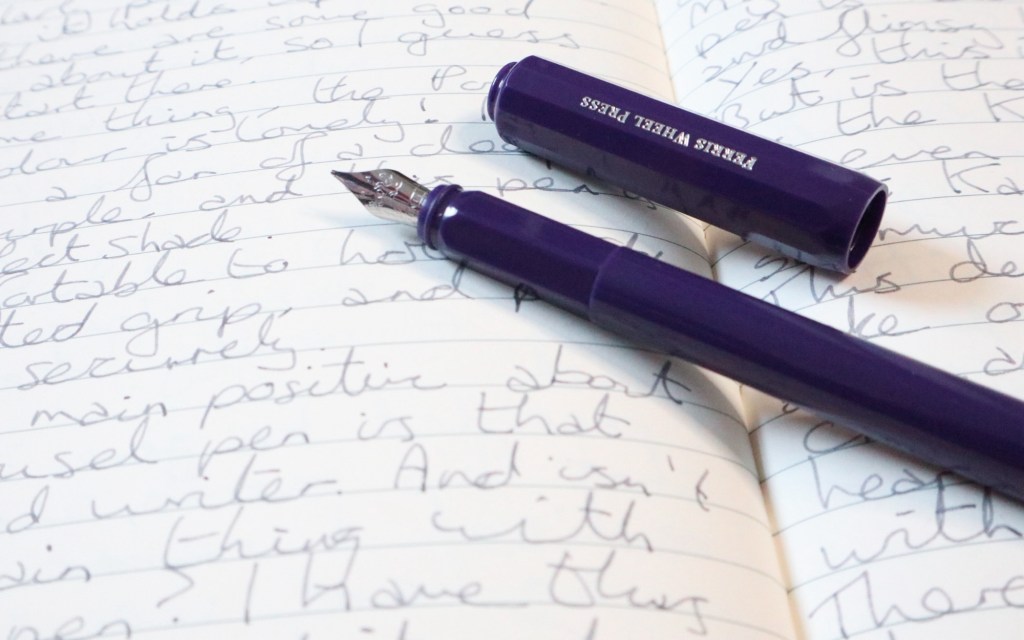
For one thing, I love the Poison Envy colour! It’s a deep, dark shade of purple which pairs nicely with the silver embossing on it (Ferris Wheel Press on one side of the cap, Carousel on the other).
It’s also comfortable to hold, being a nice size and weight when posted, and having a faceted grip section that fits nicely in the hand. And the main positive of the pen is that it writes nicely, and isn’t that the main feature you want in any pen? I have it in a fine nib, and whilst it’s perhaps a bit broader than I’d like, it’s a smooth writer, and as it turns out, handles shimmer inks really well (notable for a fine nib!).
So what’s the problem with this pen?
For me, the biggest problem is how cheap the pen feels. Yes, this is a cheap pen, so I’m not expecting anything too amazing in terms of sturdiness, but for the same price point I could buy a Kaweco Perkeo, which has a very similar design, but feels much more substantial. This pen feels so delicate I’d be scared to just throw it in my bag, as I’d worry about it cracking, which kind of defeats the idea of having a cheap throw around pen.
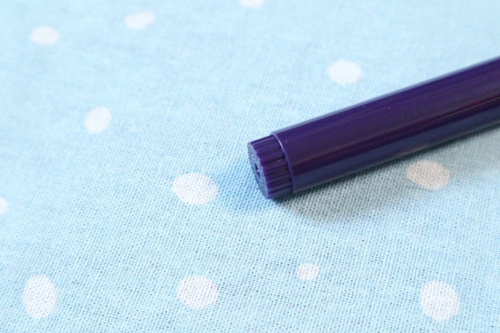
There’s also a couple of design elements on this pen that I don’t love. For one thing there’s the weird notched detail at the bottom, that doesn’t seem to fit with the rest of the pen, and the grip section also doesn’t seem to match up with the pen. Whilst the faceted grip is comfortable to hold, the body of the pen is cylindrical whilst the grip is faceted, and there isn’t really any transition from one to the other, like you’d get on a Lamy Safari, for example. One part of the pen is just one shape, and the other is another, and so it looks kind of weird in my opinion.
On its second outing, inked with Diamine Moondust, this pen had grown on me a little bit, and I certainly won’t be getting rid of it. I like how it writes, and how it handles shimmer inks, but I also think for this price point there’s better pens out there than this!
I have been intrigued by the aluminum version of this pen, just because the designs and colours are nice, and I’d assume being a metal pen it would feel more substantial. But I also just worry that maybe Ferris Wheel Press’ pens just aren’t that great, and so I’m not sure I’m willing to risk it for the price.
So do you have a Ferris Wheel Press Carousel fountain pen? What do you think of it? Have you tried any of the other Ferris Wheel Press pens?

Leave a reply to Emma Judson Cancel reply